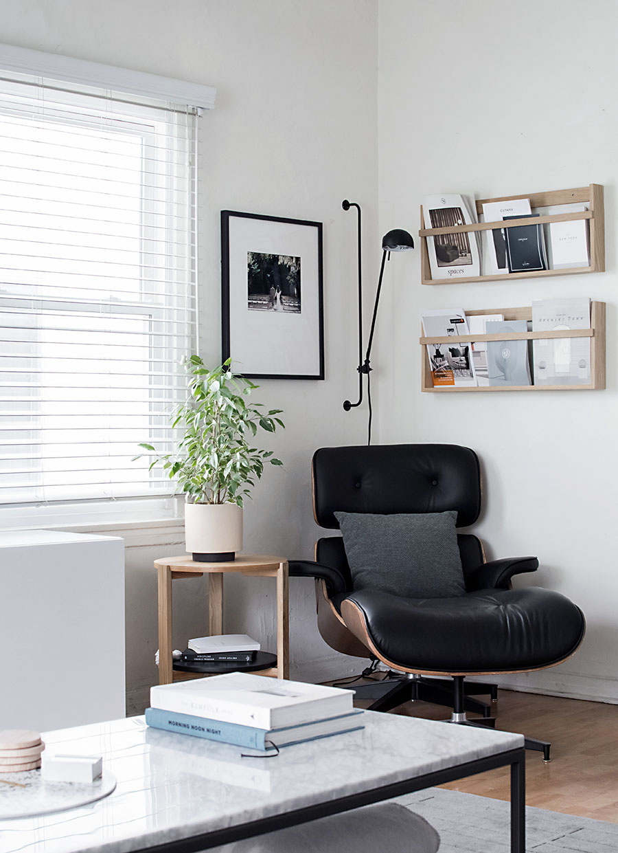
Deciding what to do with this little corner of our living room has been about a two year process, the majority of that time being spent ignoring it and letting it pile up with boxes and mail while I held out for some unknown better ideas for general changes I knew from early on that I wanted to make.
I took the patient road of waiting for the ideas to find me (plainly meaning not actively or hastily searching for things to buy) with hopes that this would organically develop into a functional space over time. Then it built up pressure in my head to make some grand reveal out of it once it reached perfection and now it’s been two years of people regularly asking me why I don’t show the other side of our living room, which made me laugh because that was noticed. The reason I haven’t shown it, which is that I’m still figuring it out, sounds silly now that it’s been so long, so let’s take a look at what we’ve got so far and talk about how I hope to update it in the future, maybe sooner than another couple years I don’t know!
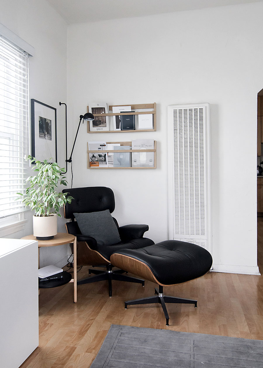
The frustrating thing about this corner, which actually doesn’t bother me nearly as much anymore, is the wall heater that doesn’t work. Now is a good time to point out a common misunderstanding about our home- we rent an apartment, which means we cannot make renovations or rip out that old carpet in the bedroom, so things like a broken wall heater stay and we work around it.
My first idea was to put a sideboard here to hold our nicer dinnerware, linens, and anything we use for entertaining vs. daily use. I still love that idea the most and think we could really use something like that, but the wall heater placement made it hard to find a sideboard small enough to fit into that corner. I also thought it would look strange to have one wedged tightly against that heater, so we moved on to turning this corner into a reading nook, and I made the most fatal mistake
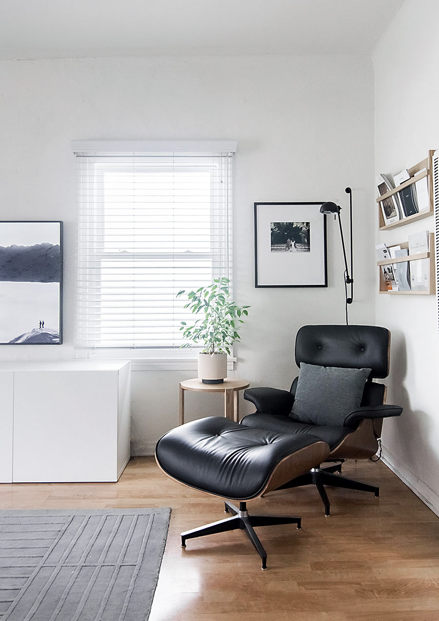
That chair, a replica of the famous Herman Miller Eames Lounge Chair, is terribly uncomfortable because it’s poorly made. A friend best described it as feeling like you’re sitting at an acute angle, ha! Truly the only thing a reading nook should have is comfortable seating, and right out the gate that failed. Two things to note here: 1) Because the chair was from an online source, there was no telling ahead of time whether it was actually comfortable, which is why you should source from places with great return policies. 2) Replicas are safer to take a chance on when it’s something decorative and much riskier when it’s something you have to put your body on, like furniture. Luckily we learned that putting a pillow there for lumbar support makes the chair bearable to sit in, but it’s very disappointing nonetheless that the chair falls so short from the real thing.
To be frank, I love the look of the chair and resolved to keep it temporarily for aesthetics (plus the cost of returning it was not worth the trouble- always check return policies!), but it’s been there for literally two years now. It can discourage us from actually sitting here to read, which is the entire point of this corner so that certainly needs to change. The dilemma is that I haven’t found an alternative that I love enough yet, but I’m looking!
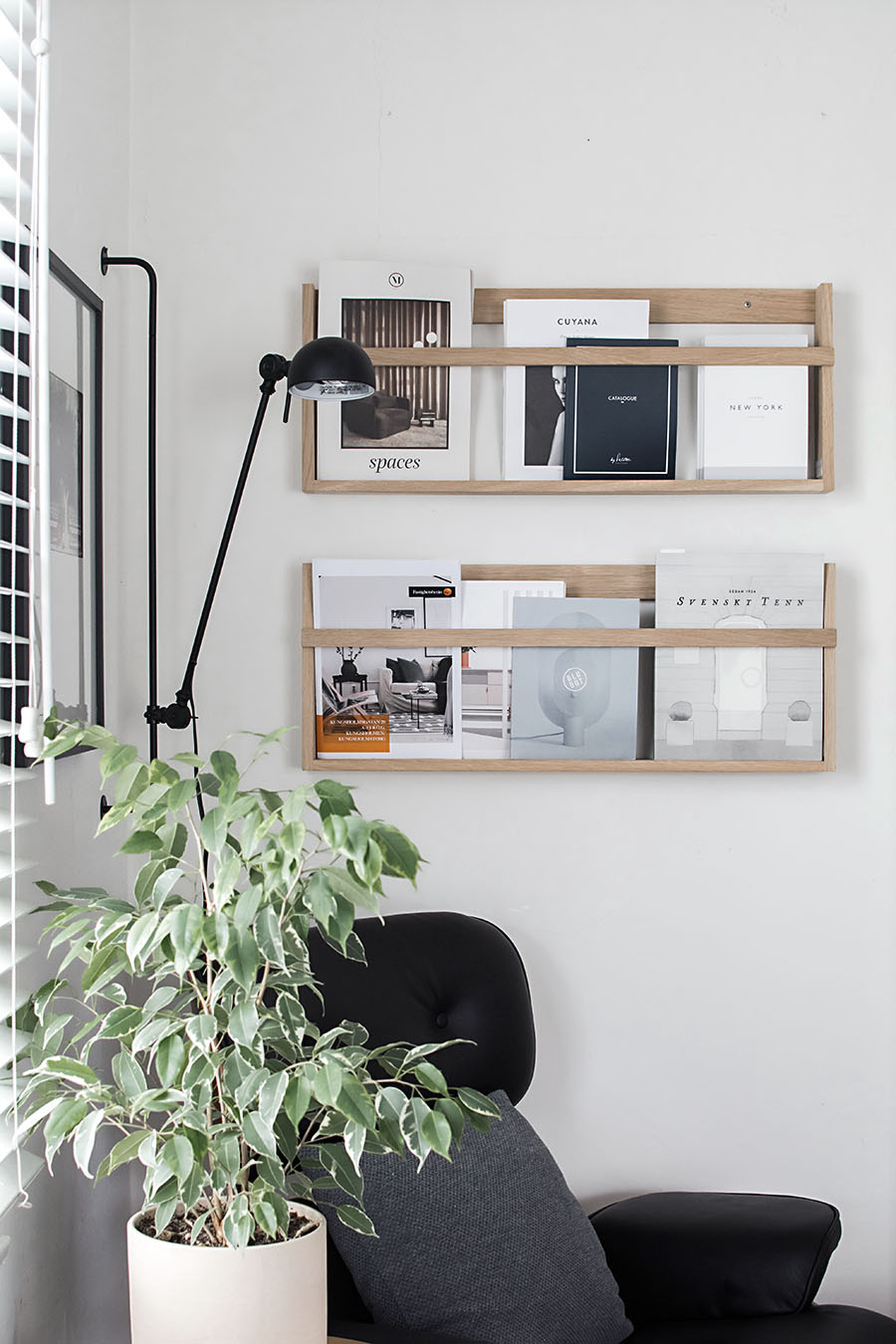
The nearby media cabinet underneath the TV houses all of our books, which left this wall to be a space where we could keep mostly magazines and catalogues that I rotate out when new ones come in the mail- I love keeping up with some of my favorite brands this way.
These are the Vega Magazine Racks from the Danish brand, Foxy Potato, which I got years ago with utmost assuredness that I will love them forever. Isn’t it exhilarating and rare to come across these kind of finds? Still, Oleg made a great point saying that he wished we had all our books displayed on this wall, that it would encourage us to revisit old ones and read the ones that never got read, oops. Recently it’s made me consider putting a tall bookcase here, similar to the look in this beautiful Swedish home I posted on Instagram. I’ve always believed that displaying books is one of the most interesting ways to decorate, and it’s typically my favorite thing to admire in someone else’s home. Meanwhile, I can easily find another spot for these magazine shelves if need be.
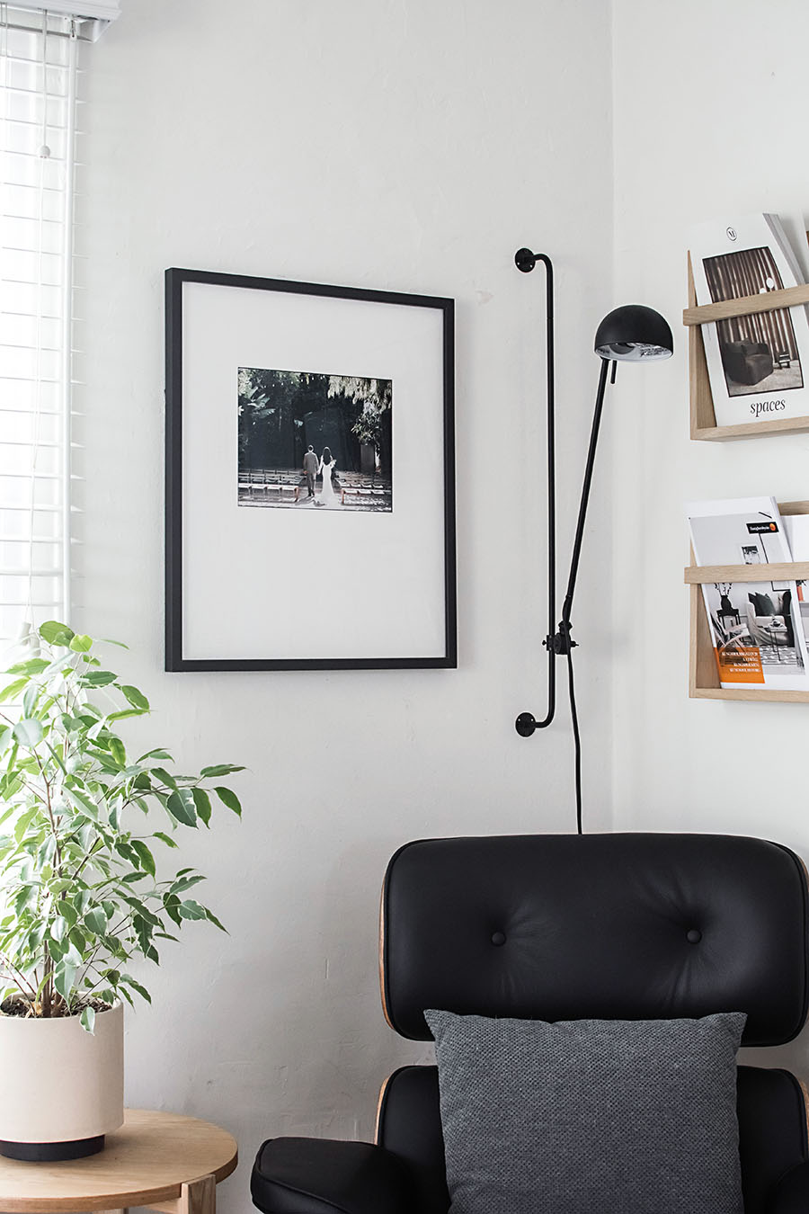
Putting a sconce here was a no-brainer in terms of saving space, and that deal was sealed when I found this one. It’s adjustable in height along that rail, can swivel around it, and is just so sleek. It really finishes the space with its unique design and it’s the detail I’m probably most happy about.
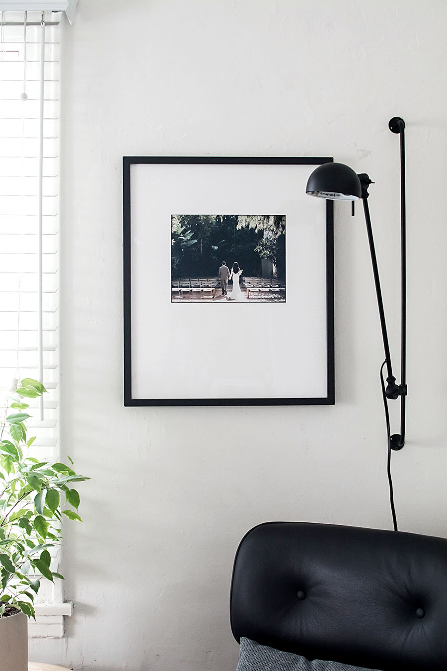
Picking the art for this wall took a long time, as is the theme for everything in this post. Once I decided I wanted it to be a photo from our wedding, picking one became an ordeal and I realized something interesting through the process. I think it’s mad cute and heartwarming to see wedding photos framed and hung up in other people’s homes, but when it came to ours, it felt awkward. Is that strange? The thought of putting up a photo of us kissing or posing romantically made me feel shy, even in our own home, and Oleg agreed too. WEIRD. So I went with one that wasn’t so obviously a wedding photo, but still brings me back to that day and gives me the feels. Oleg approved of it too and we both smile about it, so I think it was the best choice.
I got it custom-framed at Michaels with a custom weighted mat, which I’ve noticed has become a really popular framing style these days! I love that it brings even more focus to the photo as your eyes try to balance out the negative space. Looking at it now, I wish I had gotten the mat an inch or two longer on the bottom, but it’s no biggie. This is also a great option for hanging a landscape oriented photo to take up a portrait oriented space on the wall.
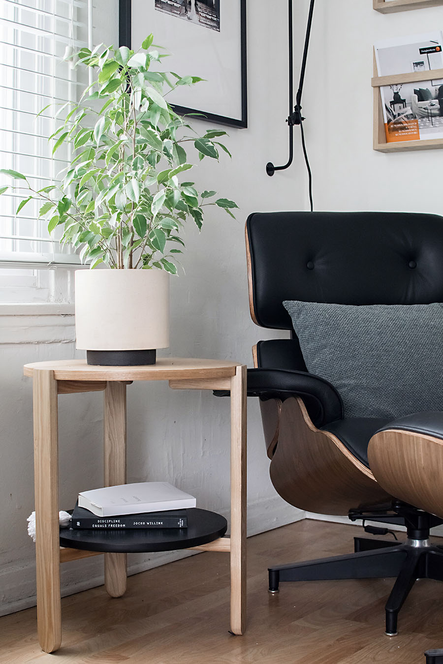
The side table (discontinued) I like for a couple reasons. It makes it possible to put that plant here and the bottom shelf is real nice for storing reads that are in progress. This was an extra side table I had hanging around that didn’t have a place to go and ended up here during the time I was using this corner as storage for other items that were also in limbo. All that means is that it wasn’t an intentional choice to put the table here, though I think it still works nicely despite me wishing it was less matchy with the chair, but that thing has got to go anyway so who knows where that side table will ultimately end up.
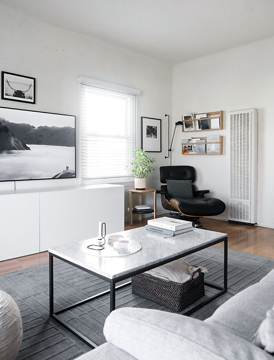
After all this talk about mistakes and changes I still want to make, I want to express that I think this little corner looks great and I’m happy with the way it is right now. I owe that to not rushing the process and letting the decisions happen naturally in their own time, remembering that even though the space is not yet at the end of its evolution, it’s still worthy of enjoyment and gratitude for how it serves us now.
The point I want to make is that this stuff takes time. A lot of the home inspo out there can make it feel like people knew right away exactly what they wanted and made it happen in days when really it takes months, maybe years of figuring out what you really love and need. It’s my hope to share the mistakes, process, and progress of our home journey to make that point even more clear. For now trust my words:
A home should flux and change as you and your needs change. It can look a lot like trial and error, which shouldn’t be a discouraging thing. The perfect space is relative to what you need at a given time, so go with it and be kind to yourself about all the in-betweens, even if it’s a really good looking uncomfortable chair.



Hi! What did it cost to get your custom mat at Michael’s?
Hi! It was a while ago and I can’t exactly remember… I want to say it was $150.
i feel your pain! we too also fell for a knock-off Eames lounger online & still paid more for it than i’d like to admit. yours actually looks a little bit nicer than mine. i don’t find mine uncomfortable to sit in but it was 6 months in when 2 of the buttons in the seat ripped through the “leather”. so now, as long as nobody sits in it, i can dig in the seat to find the buttons and pull them back up to look nice. on more than one occasion, a guest has come to me very upset thinking they ripped the leather on the chair! ha! we learned our lesson though!
Haha that’s another thing- I always feel bad for guests that try to sit in our chair!! It’s the first place anyone tries to sit down and I’m always feeling like I have to apologize and explain why it’s uncomfortable. That’s not fun for anyone!
Hi,
Where did you purchase the light from and/or what is the brand?
John
Hi John, I linked it in the post.
Looks great! My eye was immediately drawn to the wedding photo as I just recently got married and am debating how to display photos in our apartment. I’ve read that it’s often recommended to keep wedding photos out of the living room—which is silly to me since they’re the most expensive ‘art’ I have, ha! But this advice doesn’t account for more artsy wedding photos IMO. Seeing yours in your living room makes me feel more confident that it totally works as long as you are able to choose something that also has a strong aesthetic quality.
We have a small space with very few surfaces for display purposes, so any wedding photos will have to go on our walls. I had actually already ordered a 24×36(!!!) to go over our bed, but now I’m thinking I might sneak one into a corner of our living room, too 😏
As for the chair, would you ever consider getting a real Eames? I was going to say the “coconut” chair would look great there, too, but it is even more expensive! 🤯🤑
I can see why it’s advised to keep wedding photos somewhere more intimate and private like the bedroom. Still, your house = your choice, do what feels right!
Yea the reason I went with the replica was purely for cost so a real Eames is out of the question haha. The coconut chair is beautiful!
Love the little reading corner of your living room! All the small decor pieces fit so well together. We often decorate homes all across London and it’s great to see your posts for inspiration. Thank you for sharing!
Hi!
Would you share where you bought the replica Eames? More of a deterrent not to purchase it from the same company?
Thanks!
It’s discontinued pretty much right after I got it so no longer available thank goodness. No brand name on it.
Super inspired by your reading nook and hoping to put together something similar in my master bedroom. I have a whole bunch of space in one corner and no functional need for it, so I love the idea of a place to sit and read that keeps me out of bed. The real deal Eames chair has been at the top of my list of splurge items for a long time now. The real one is insanely comfortable, and I’m really thankful to people who’ve purchased cheaper (but I know their not cheap!) look-alikes who share that they aren’t worth it. More incentive to keep on saving.
Yes, this is one of countless examples of getting what you pay for! I’ve sat in the real one too and nothing compares.