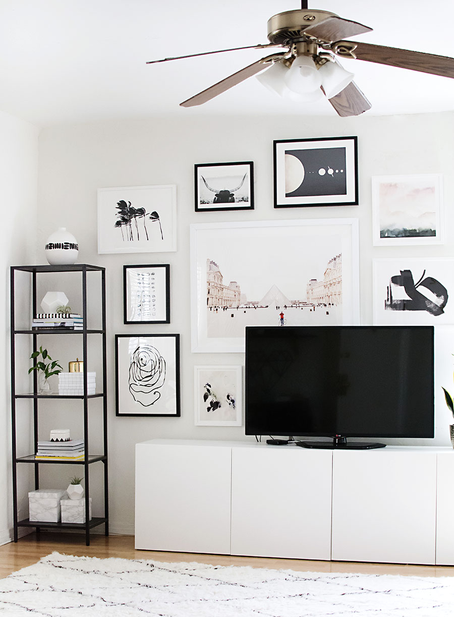
Really excited about this post because I get to share with you some of the changes I’ve made so far to the living room, the biggest change overall being the color palette! Re-doing the gallery wall was a first step because all the random colors from the previous setup were driving me crazy, and it’s the gigantic focal point of the room which made it a priority for me. So this time around, I went with a color story. Are you surprised to see that it’s black and white?
I couldn’t help but throw in some pinks and neutrals because I loved those prints so much, and I ended up loving even more how they warmed things up. I also took requests from boyfriend after making him look (I watched him do this) through ALL the art on Minted, who partnered with me on this project. In general, he requested palm trees, animals, and cars… I granted him two of three because I’m nice like that.
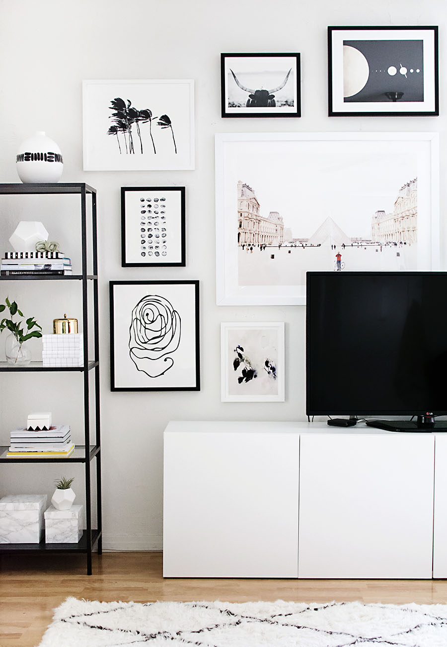
I’m loving how much cleaner it looks now that the frames are all uniform in style, and I was really excited about how each one is fitted with hanging wire = WAY easier to hang than all the random backings of the frames I had before, and I could still apply the same technique I always use for planning the layout. Sure, there are hanging tools available to help with wire hangings, but those typically require two people. I hung up everything all by my lonesome, and this is how.
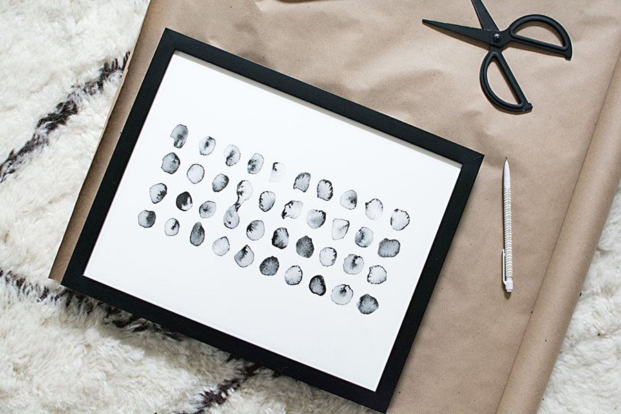
I traced each framed print onto kraft paper (from the dollar store) and cut out each piece.
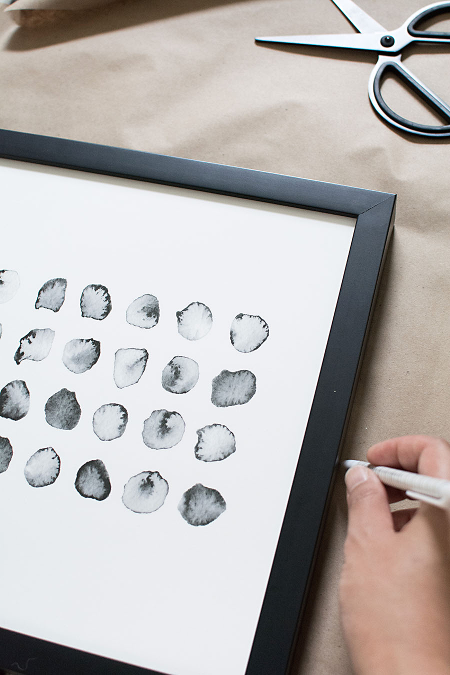
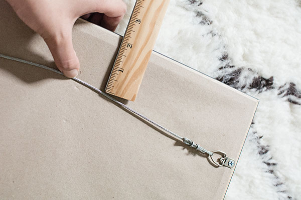 Pulling the wire up as tightly as possible, I measured the distance between the wire and the top of the frame, then marked that distance on the kraft paper, seen below as the horizontal line in pencil.
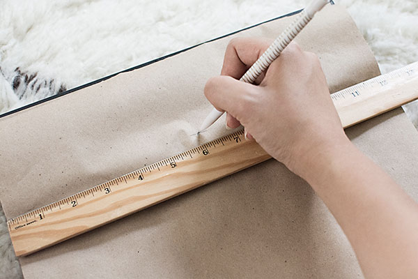 Using the ruler again, I marked the horizontal half way point of the frame on the previously drawn line by drawing a dot. This marks where the nail will go in the wall.
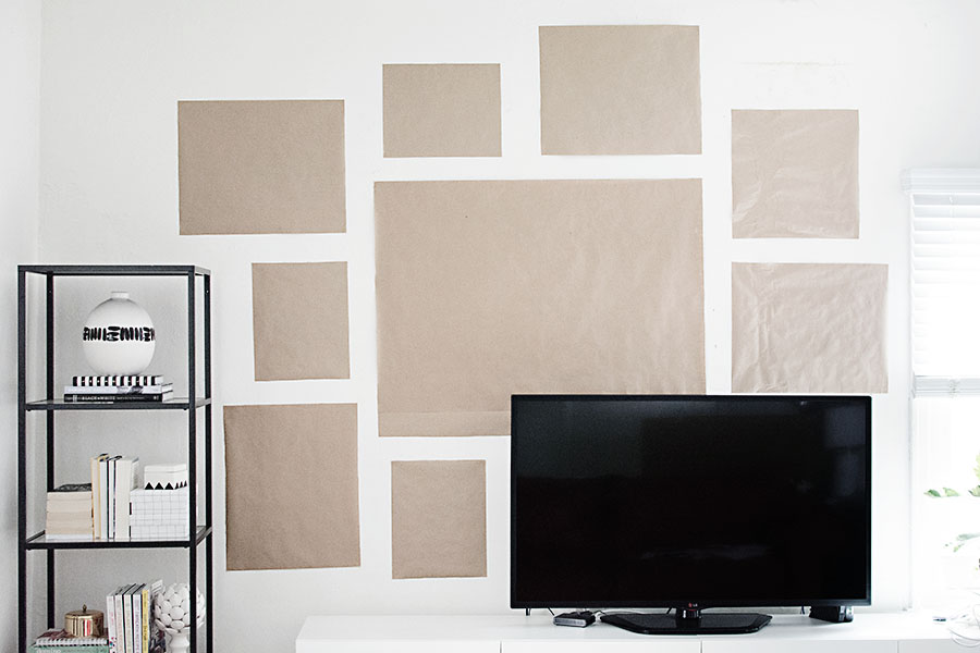 I taped all the paper up with double-sided tape to keep the edges clean, which is really helpful for clearly seeing the spacing between frames. I kept the spacing to at least three inches, a little more in some parts, but no less anywhere.
After adjusting all the paper placements about 37 times, I hammered in all the nails where the pencil markings were, ripped off all the paper from the wall (feels so good), then hung up all the art.
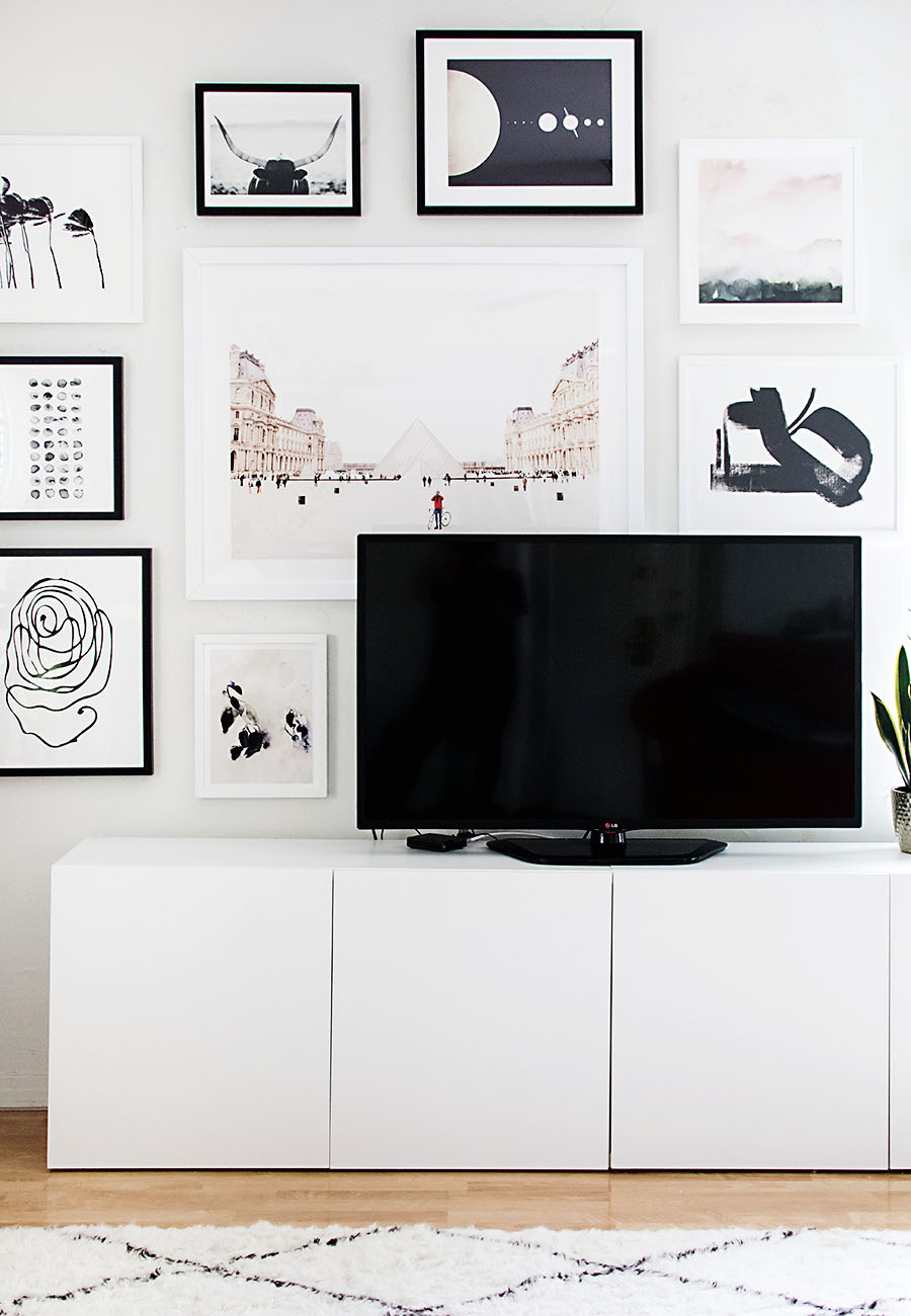
Layering a large piece of art behind the TV really helps it feel continuous with the rest of the wall. It’s my favorite little “trick” for a TV gallery wall, and yes, I definitely thought about how that man on his bike would look like he’s chilling on top of my TV. Love him.
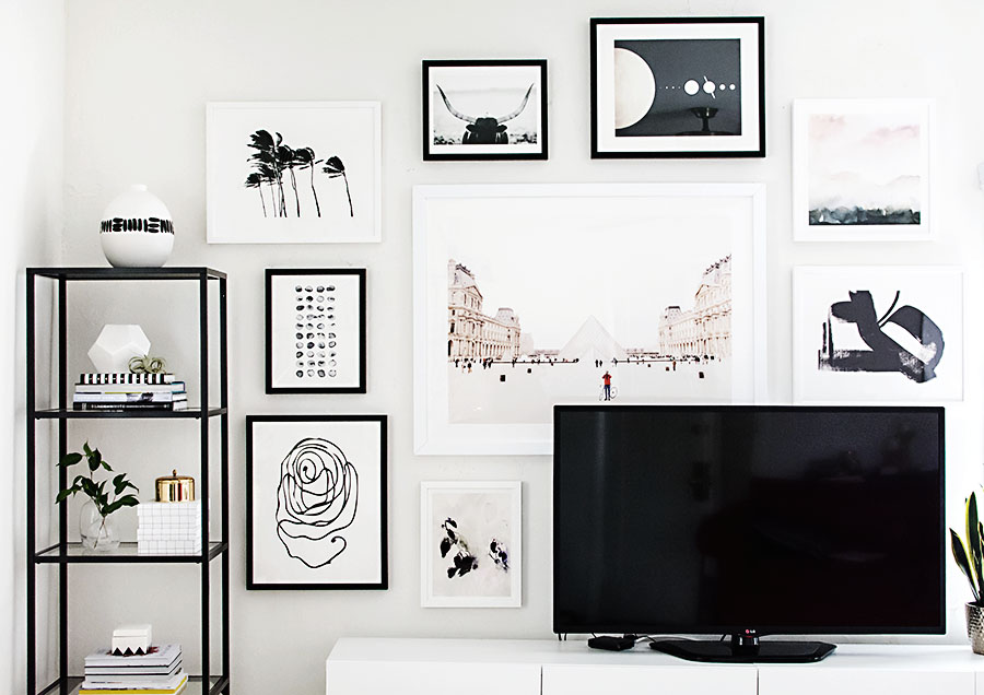
A lot of what drove the plans for this wall was to cover up all the old holes while still putting up less art than I had before. I wanted the wall to look lighter and less chaotic than it did previously, and choosing prints with a lot of negative space really helped achieve that goal. I also tried to vary up the mediums more, this time including watercolors and photography along with graphic and abstract art. I’m really digging the way they all look together more than I already loved each piece individually. Do you have a favorite out of the bunch??
If you want to know more about each piece, you can find all the links here:
Sources
- Men in Red, 40×30
- Perinuclear No. 2, 20×16
- Palm Trees in the Wind, 20×16 (I think this one is my favorite)
- Planetary Neighbors, 20×16
- Untitled 1b, 20×16
- Evening Flora, 14×11
- Staredown, 14×11
- Calculation, 14×11
- Wake II, 16×16
This post is sponsored by Minted. Thanks for supporting brands that help keep the fun projects coming!

This is stunnnnnnnnning! WOW! It’s amazing the difference you can make just by hanging a new set of prints and paintings! Bravo =)
Aw thanks Carrie! And yes, it’s made ALL the difference.
Meine Liebe, deine Arbeit ist einfach wunderschön…ich liebe das alles…bitte wo kann ich diese schwarz weiße Vase kaufen? Lieben Dank, Marcia
I just finished my gallery wall; wish I would’ve seen this before! Definitely loving the black and white though. I may have to switch out some of my more vibrant ones for this palette!
XX LAURA
girlwhowrites.com
That’s the thing, gallery walls can always be edited and changed. I’ll probably switch things out over time for sure!
This is one of the better gallery wall tutorials I’ve seen. I love the way it turned out!
Kristina does the Internets
That is a great honor. Thank you, Kristina!
I love the black shelf! Where did you find it?
Hi Ashley! It’s from IKEA. You can find it here.
So gorgeous! I love the monochromatic palette you chose :)
Thanks Caitlin! All about that monochrome.
This is GORGEOUS! The color palette is so perfect with the hints of neutral. I agree that it definitely warms up a stark black and white palette – it feels like a new twist on a classic. But my favorite part is definitely the little guy hanging out on top of the TV! Haha! Love it. Amazing job!
Haha so happy you like him, too! Thanks, Amanda!
Love the color palette. So calming! :)
Also, where is that TV stand from? I loooove it! <3
Thank you! The TV stand is two Besta units from IKEA.
aww thank you :) So helpful !
Such a gorgeous job. Even this color-loving girl LOVES it!!
Oh dang that’s huge! Haha thanks, Haeley!
Lovely layout. Looks great! Using the paper to see the space that each piece takes up and space between is pure genius. I haven’t seen that done before.
Good post. I absolutely appreciate this site. Stick with it!
Thank you so much, Hollie! I appreciate you being here.
Looks So good
can you please tell me where you purchased the rug? thanks
Hi! You can find the rug here.
Can you tell me where you found that tv stand?
Hi Rachel! It’s the Besta unit from IKEA.
The perfect gallery wall! Where did you get the frames?
Hi Amy! Where are you frames from? I have a wall I have to fill and it’s so hard deciding what prints will look good on there. How do I go about figuring it out?
Any help would be appreciated!
Hi Sharon! The framing was done by Minted.
I use photoshop to plan an arrangement of art. I’ll take a photo of the blank wall then paste on images of art I’m considering and play around. If photoshop isn’t available to you, try putting together a Pinterest board to at least get a sense of a grouping of art that you like.
I completely agree it is so hard deciding on prints, especially when trying to do it all at once. My best advice over everything is to take your time and really pay attention to the things you LOVE and not just things you think will look good- sometimes that difference is hard to tell!
I love this! Trying to figure out how to do something similar in my home. May I ask how large that TV is? I’m worried the one we have is too big to look this lovely!
Thank you!
Hi Rachael! Our TV is 50″. I think this’ll still work with a larger TV, perhaps if balanced out with a larger piece of art. I think as long as it’s not a tone of small pieces surrounding it, it will look lovely!
So pretty! Can I ask where your rug is from?
It’s from Rugs USA! The Tuscan Moroccan Shag.
Love the tv stand! Do you by any chance know the length of it?
This is so incredibly helpful, I love a gallery wall and never knew exactly how to approach it. And I’ll definitely be doing some shopping on Minted -Men in Red and Untitled (the Japanese-inspired print) are so beautiful! Thank you so much for sharing.
Can you tell us which frames you selected? For example if it is a black frame, is it the Italian wood or the metal on Minteds option? Do you have a product preference?