So this previously blank wall above my bookshelf has been bothering me for a long time. Before that, there used to be a tall plant that helped cover up the space, but it’s no longer there since it outgrew the shelf, which is a yay for plant thriving and nay for blank wall.
I’m a huge fan of graphic black and white designs and was inspired to make one ever since I saw this pin on Pinterest, especially because of how easy it is! I followed the same steps except I simply used black card stock for the circles.
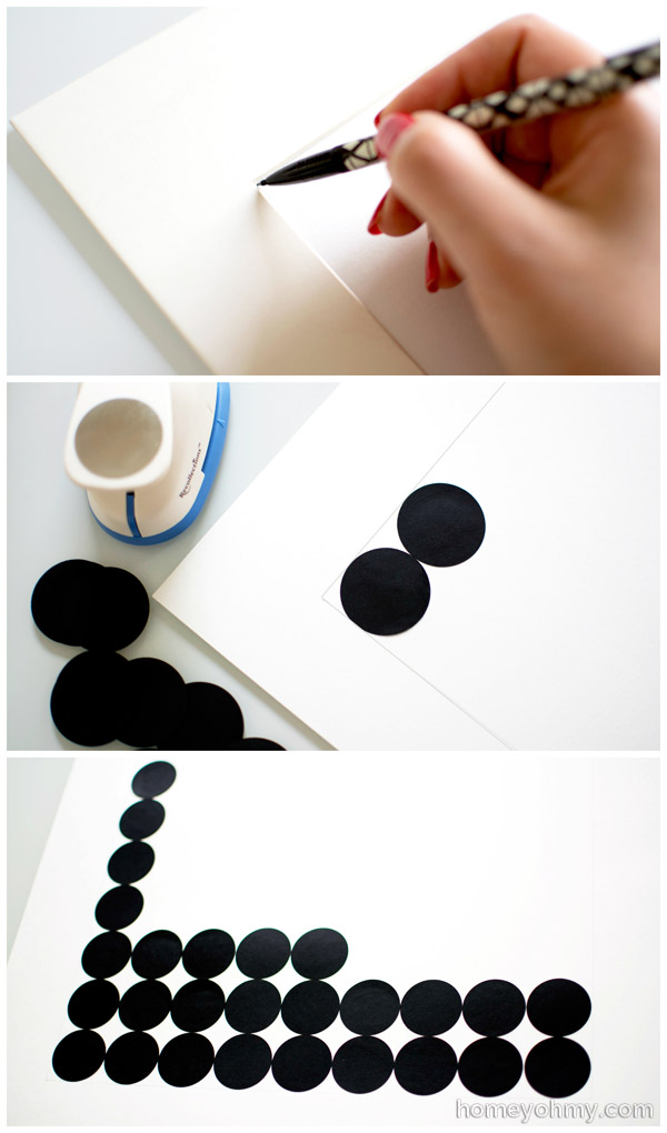
First I used a pencil to trace the inside and outside of the mat from my frame onto poster board and cut along the outside lines. The inner edges of my mat measure 10.5 x 13.5″, so I used a 1.5″ circle punch and glued on a 7 x 9 circle grid to the poster board, using the inner pencil tracings as a guide. I glued the circles on edge to edge so that they’d fit perfectly inside the mat.
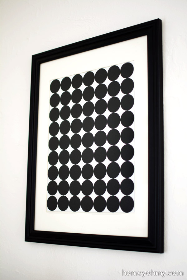
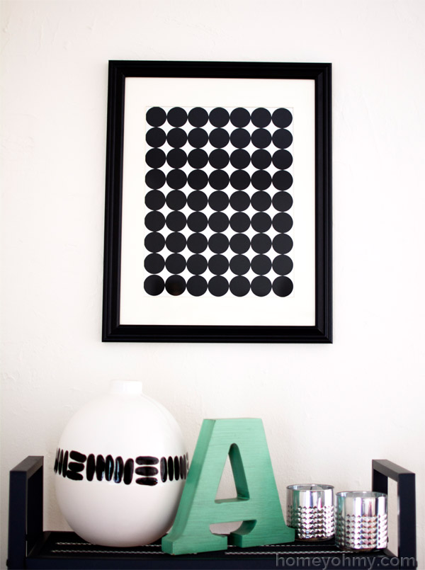
I love how the art looks with the white mat. It creates such a nice contrast to the bold cluster of circles.
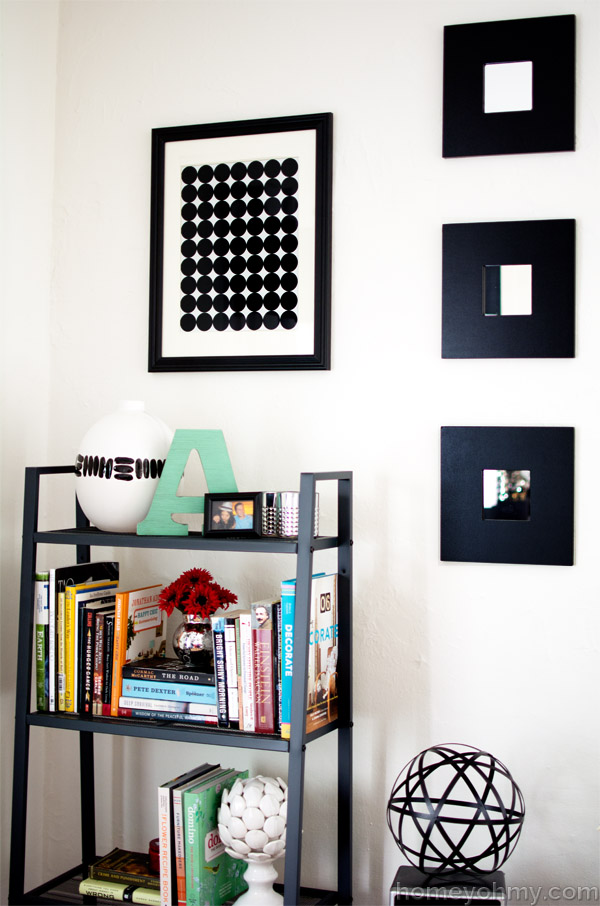
The art is hanging up in this corner of my living room and I’m sure you can imagine how glaring that space above the bookshelf would be without it hanging there. I would have gone with a mirror if it weren’t for the mirrors on the right side. There are actually twelve more of those square mirrors off to the right. Yeah, another mirror would have been mirror overload.
I’m contemplating making a collection of black and white pieces maybe to hang up all together gallery style. Probably not to hang here but on another blank wall that’s bothering me! What do you think about black and white designs?

Love! I’m kinda obsessed with all graphic black & white patterns right now. I have some b&w art my husband did in college that is about to come out of the portfolio and find its way on my walls. :)
Love it!!! Simple, clean and beautiful!!
So simple, but yet so perfect! Above that bookcase is a great spot for it!
This is so pretty and seriously works in your space! LOVE!
Love it! I think my Marimekko wrapping paper art and this would go well together!
This is just gorgeous! LOVE! Pinned :) I would love for you to link up with us again this week at Thursday STYLE! We are always so excited to see you there :)
http://lifeinvelvet.com/2014/02/thursday-style-9/
so simple yet very bold!
Love it!
Love the black and white look! I think this would looks great in a gallery type of setting too.
I love this and it would be the perfect way for me to use up some of my extra paint chips.Pinned :) Thanks for sharing and by the way you have the most professional looking photos!
Oh Amy, I LOVE this! It’s so fabulous and looks super profesh. And I love how simple it is too! If I ever find time to make any projects that aren’t for my blog, I’m doing this for sure. :)
Love the fun dramatic look!
I love this! I have a fabric that I used on a chair that has a similar print and it is so simple and pops!
Amazing! So simple yet so beautiful and I REALLY love that blue A on your table. Awesome job!
This is so simple but so effective, really makes a statement and modern too. Great job :)
Such a simple and fun idea for high impact wall art! Would love for you to share at Fridays Unfolded!
Alison
Nancherrow
Such a bold graphic statement without needing color- I love it Amy!!
Simple but eye catching. It looks stunning in the room.